Project Overview & Challenge
The "Icarus" project involved creating a comprehensive branding strategy for a company focused on retro-futuristic, high-tech, and human-centric themes. The primary challenge was to develop a visual identity that seamlessly integrated these elements while conveying a sense of friendliness and safety.
Defining Key Words
The initial phase centered on establishing the core themes and concepts that would guide the branding process:
Retro Futurism
Friendly and Safe
High tech
Visual Directions
Building out a palette of potential ways to interpret the key words led to wider series of potential aesthetics to draw from. Ultimately the team pulled from more than one set to combine into the first set of explorations.


Type / Color Scheme / Logo
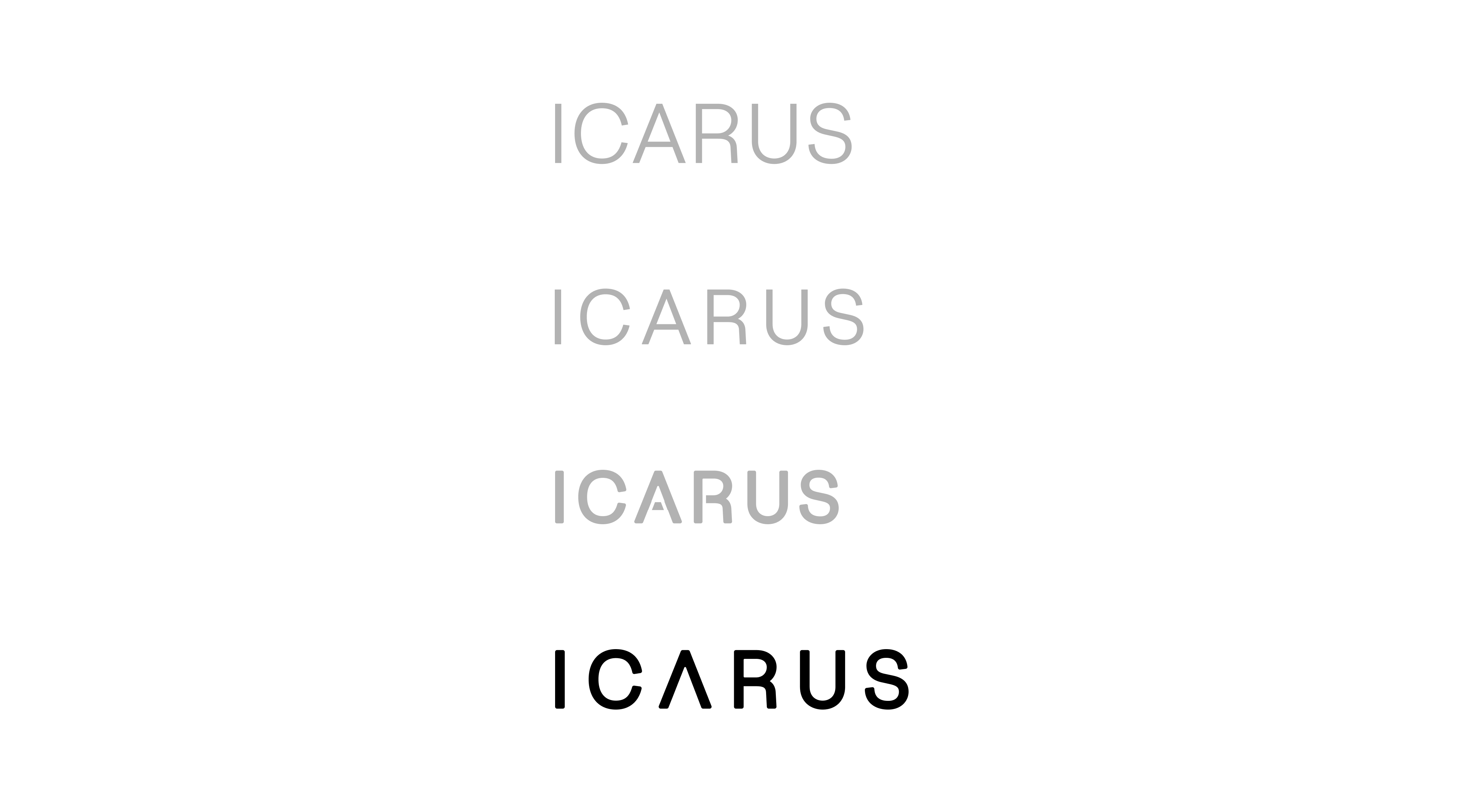
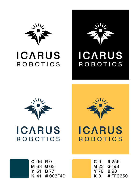
For type, leaning into a clean retro future sans serif resonated the most, and the color palette was inspired by ascending into the mesosphere and seeing the sun.
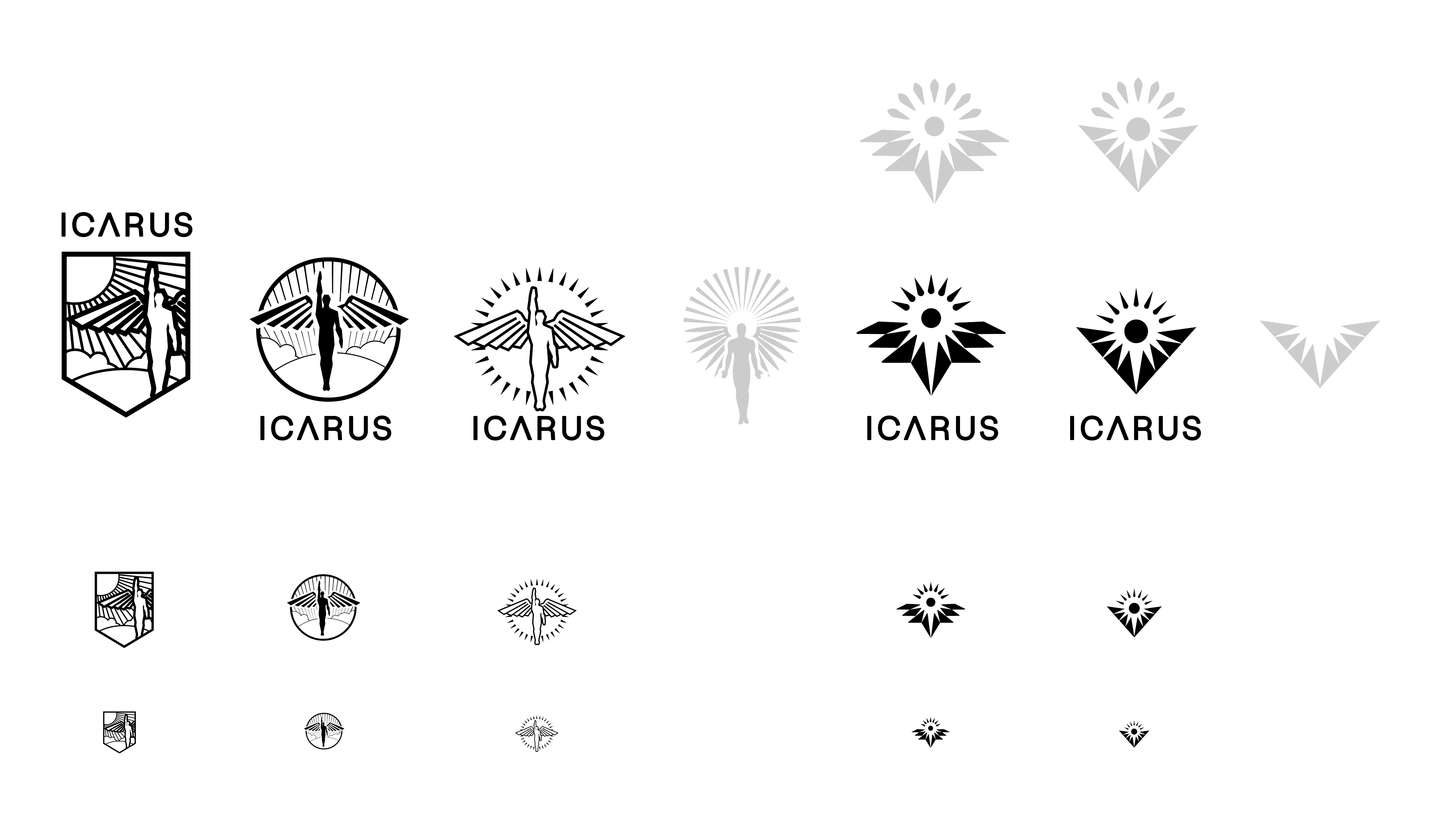
From the range of symbol explorations, reproducibility become the deciding favor while still favoring enough elements to reference the mythology of the name.

Website Banner Artwork
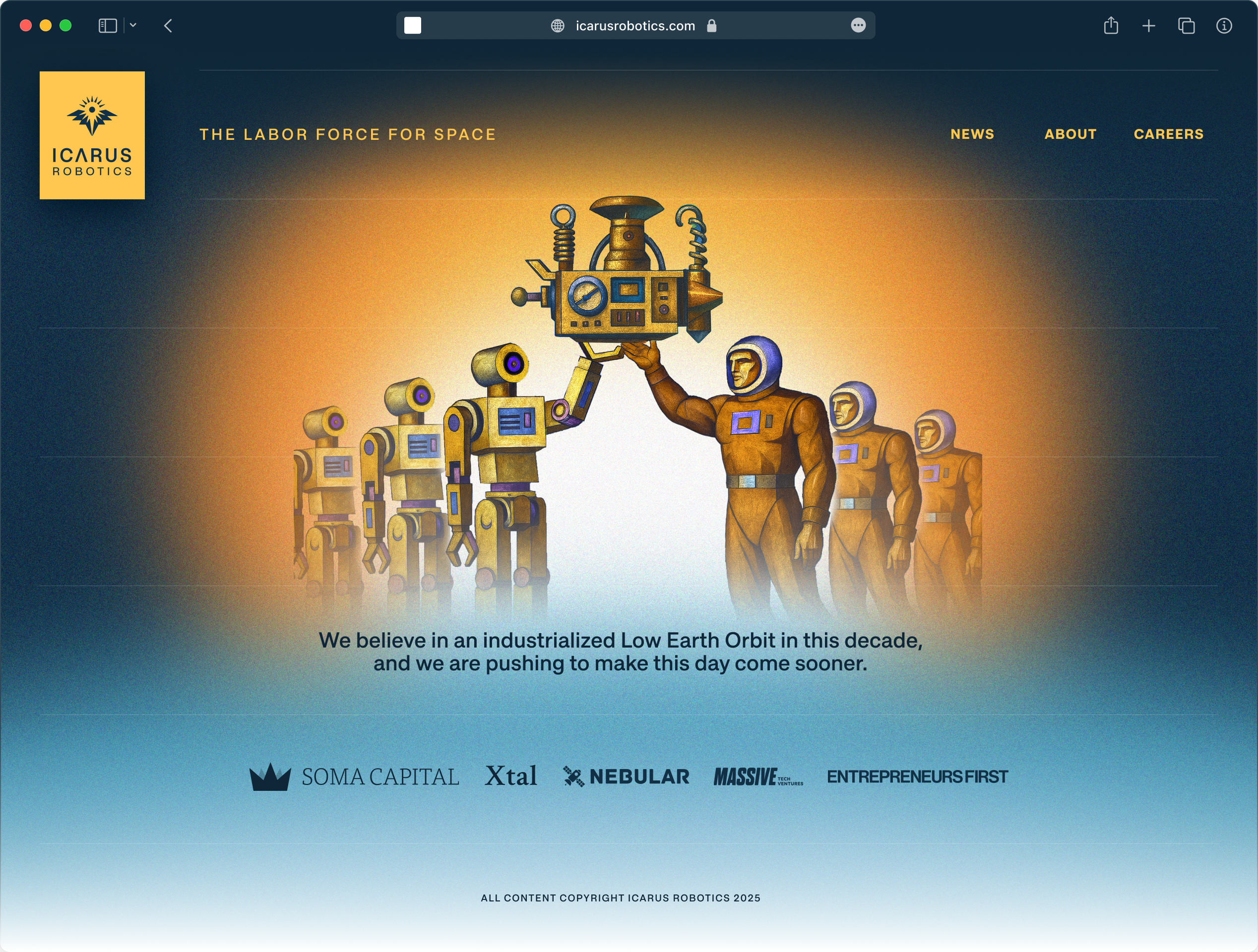
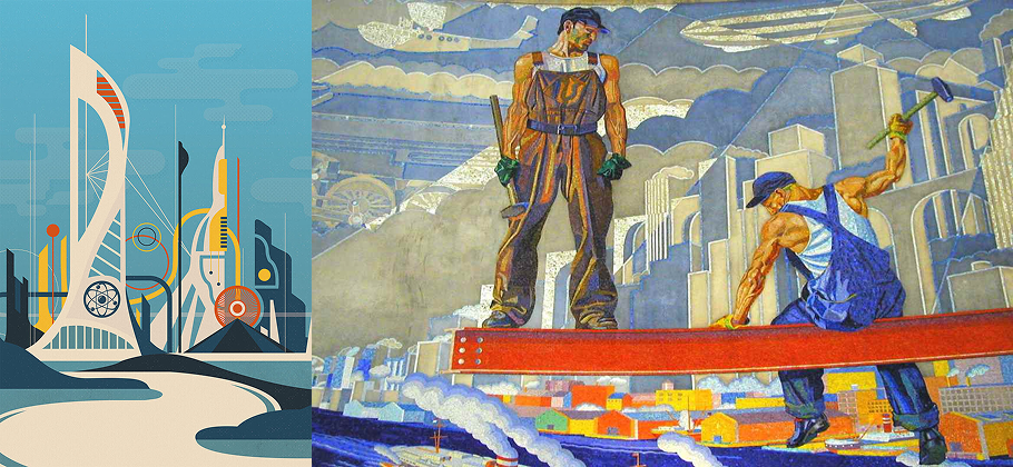
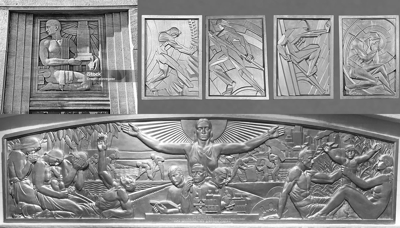
With the company mission's to revolutionize labor in space, we again sought to incorporate mid century optimism but also leaned into art deco friezes celebrating the triumphs of humanity's industrial accomplishments. Winold Reiss's and his work in the Cincinnati Union Terminal became a key inspiration in what we hoped to communicate.
Final Product
Pulling the elements into the final design, the artwork was simplified to focus on the key message of the harmony of machine and man building greatness in space. The background intended to invoke rising above the atmosphere and seeing the bright potential of a future world closer to the sun.
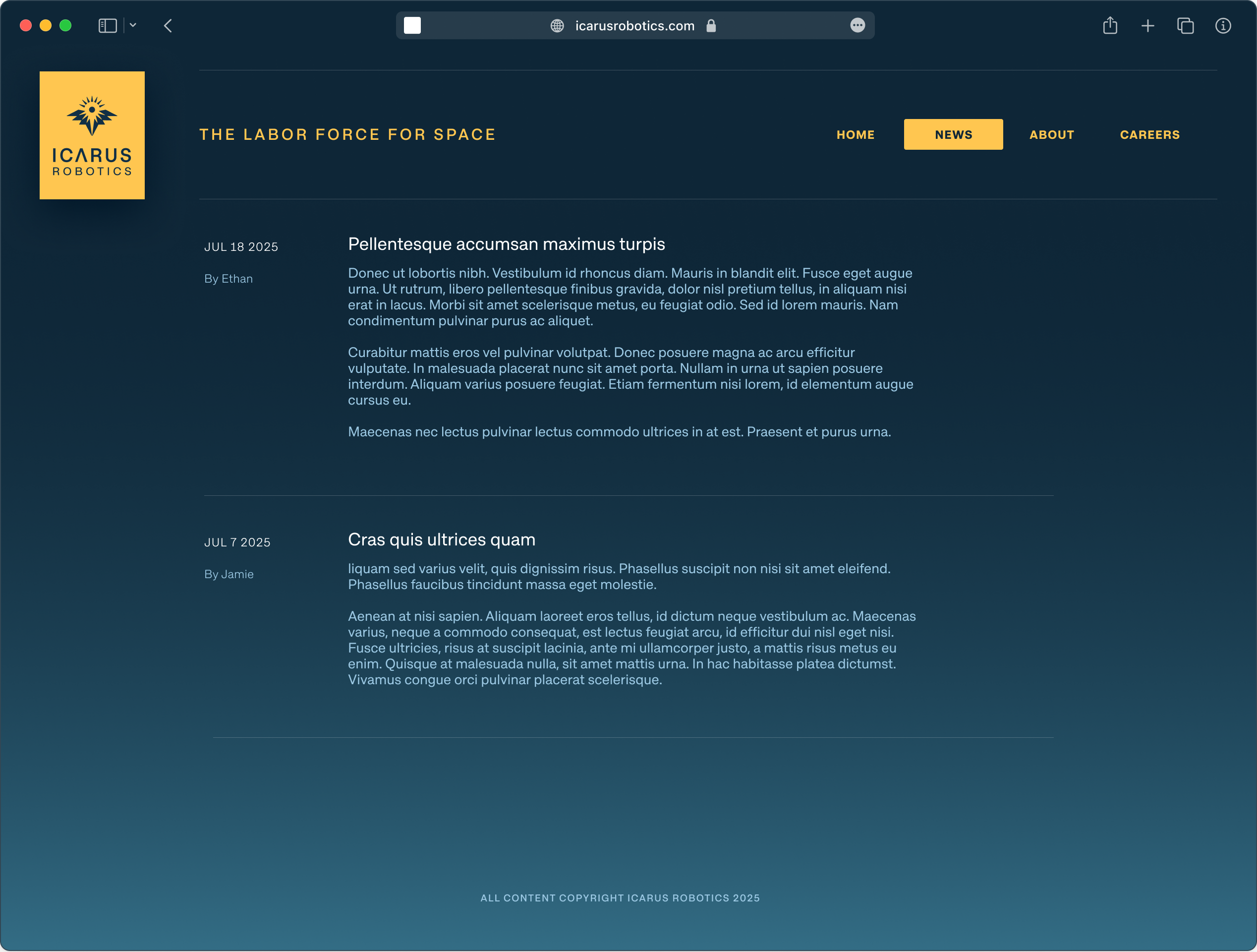
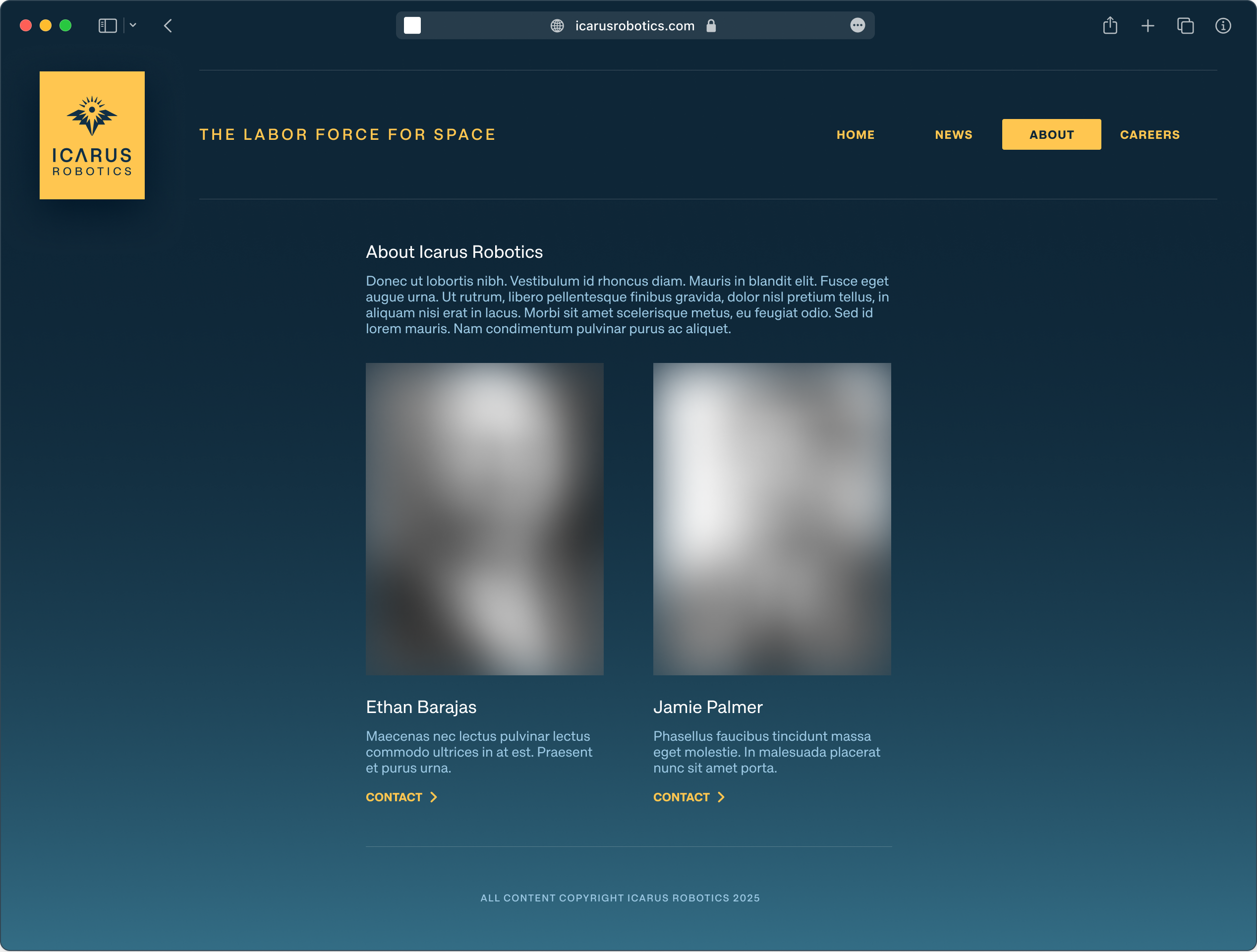
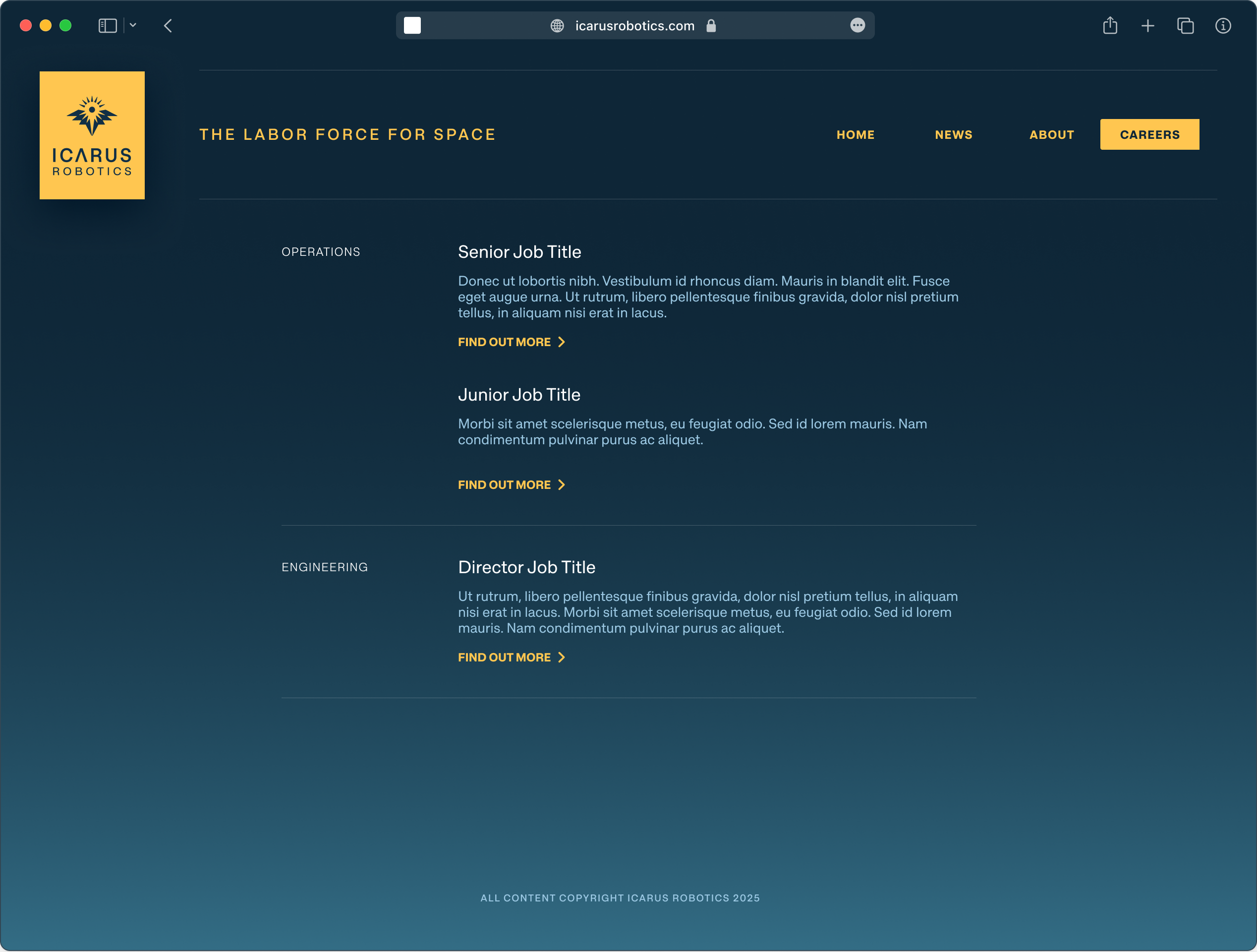
Complimenting pages were toned down to highlight content and maximize legibility while still hinting at hovering above the glow of the earth below.
